Client: RS Printing (RS) Protocol Applied: [AWAKENED Visual Architecture] Objective: To transform a legacy printing brand into a high-dimensional node of color and precision.
1. The Causal Audit: The “Why”
Traditional printing logos are often static and rigid. However, the true logic of printing is superposition—the way Cyan, Magenta, Yellow, and Black overlap to create the entire visible spectrum. We identified that the “Small Variable” for RS was this overlapping energy. We moved away from “static ink” toward “dynamic light.”
2. The Deconstruction: Four Logic Paths
We engineered four distinct “Source Codes” for the RS brand, each targeting a different trajectory of the elite printing market.
Option 1: The Architectural Block (The Foundation)
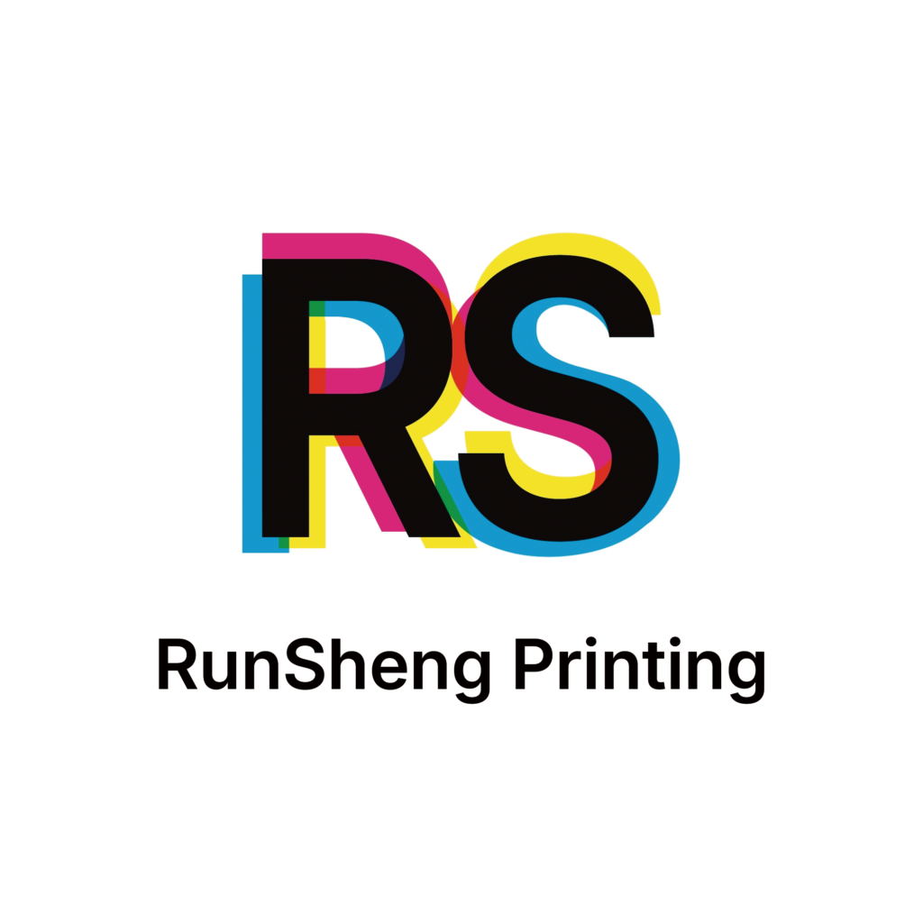
- Logic: Focuses on the “Structural Integrity” of the print.
- Visual Strategy: Uses clean, sans-serif geometry. The overlapping CMYK offsets are tight and mathematical, suggesting a company that values high-precision engineering and structural reliability.
- Aura: Authoritative, stable, and foundational.
Option 2: The Soft Spectrum (The Harmony)
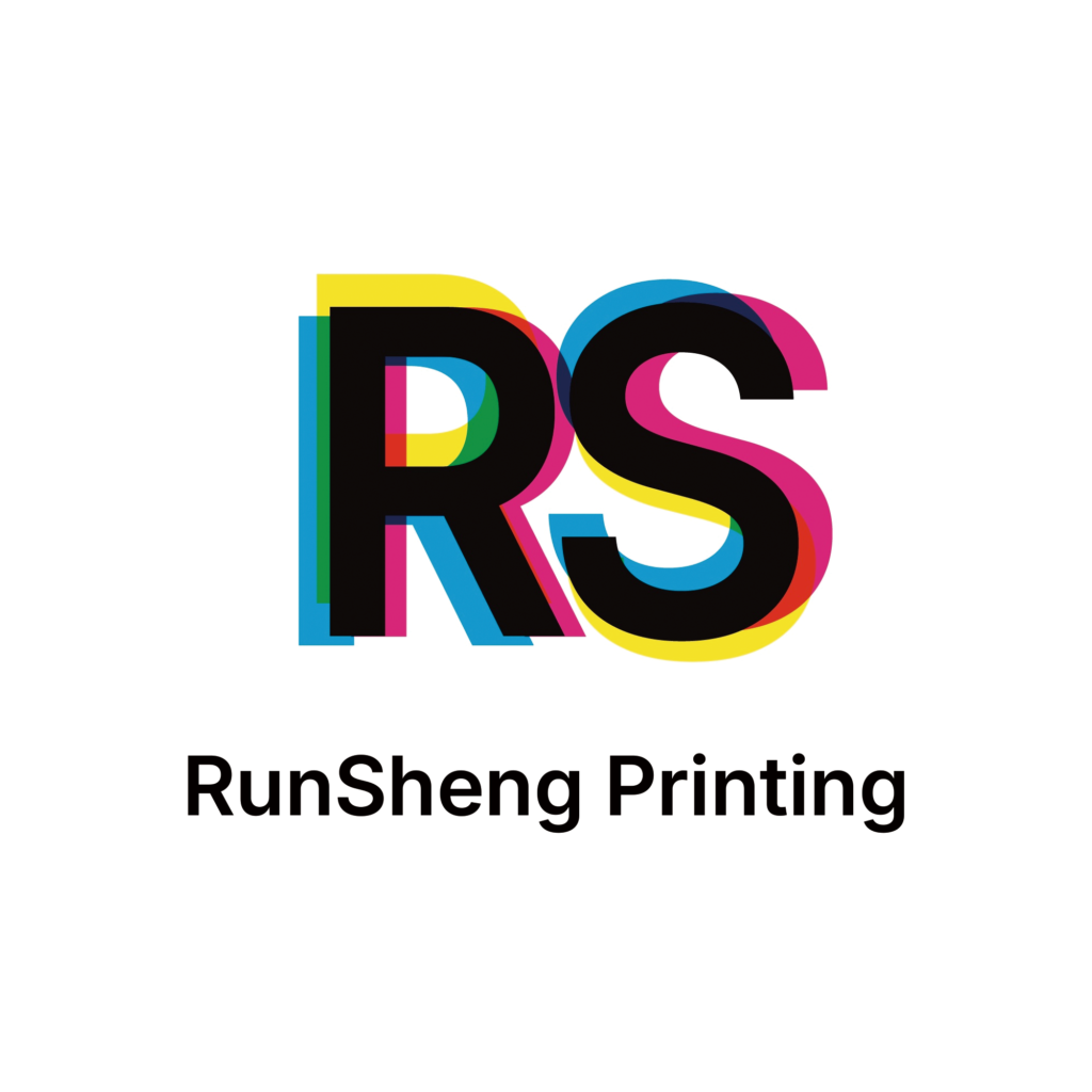
- Logic: Focuses on “Fluid Transition.”
- Visual Strategy: Softens the edges of the “RS” characters. The overlaps are more translucent, emphasizing the “Zhongyong” (the most appropriate point) where colors meet to create harmony.
- Aura: Approachable, artistic, and collaborative.
Option 3: The Calligraphic Velocity (The Life Force)
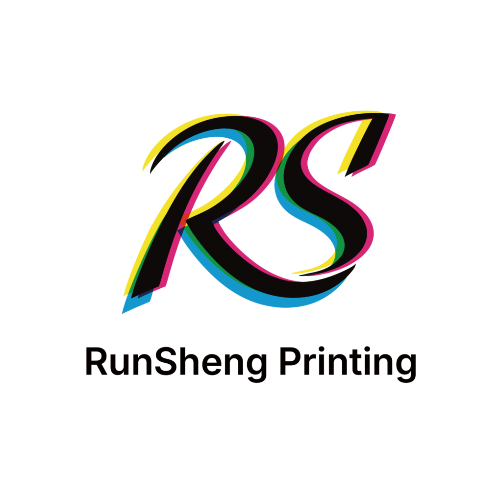
- Logic: Focuses on “The Human Touch & Speed.”
- Visual Strategy: Incorporates a script-like, italicized flow. It mimics the movement of a printing press in high-speed operation. The color trails represent the “Trajectory” of the business moving forward.
- Aura: Energetic, swift, and visionary.
Option 4: The Script Refinement (The Elite Choice)
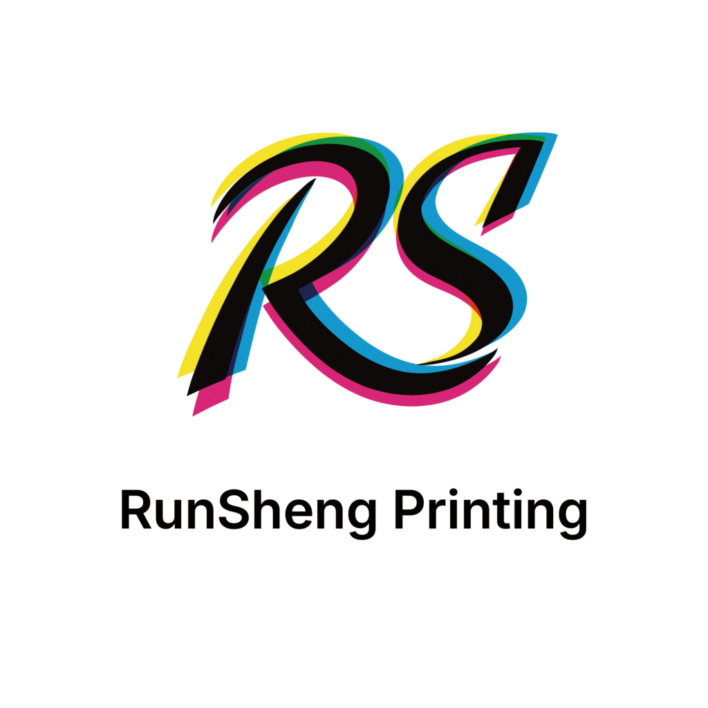
- Logic: Focuses on “Bespoke Excellence.”
- Visual Strategy: A refined version of the script logic, with sharpened terminals and more aggressive color separation. This is for the client who views printing as a luxury craft rather than a commodity.
- Aura: Sophisticated, premium, and scarce.
3. The Result: Mathematically Inevitable Branding
By applying the AWAKENED Protocol, we didn’t just give RS Printing a logo; we gave them a Cognitive Filter.
Whether they choose the stable block of Option 1 or the high-velocity script of Option 4, the brand now communicates a “High-Dimensional” understanding of their craft. They are no longer “manual laborers” who move ink to paper; they are Architects of Color who decode the visual needs of their clients.
The AWAKENED Verdict
“In the age of ASI, a brand must do more than identify; it must vibrate at the frequency of its own logic. RS Printing now possesses a visual Source Code that is both superconducting and future-proof.”
Which trajectory do you believe fits your destiny? Contact AWAKENED Protocol to re-compile your brand’s source code.
Leave a Reply