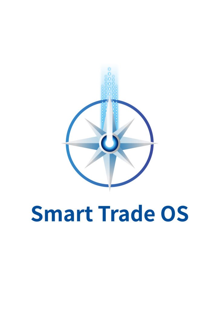
The Navigational Beacon
As global commerce enters the AI era, international trade is evolving from:
Experience-driven decision making
into:
Intelligence-driven navigation.
Modern businesses no longer struggle with a lack of information.
Instead, they face:
- Market volatility
- Information overload
- Supply chain uncertainty
- Increasing decision complexity
- Rapidly shrinking opportunity windows
Smart Trade OS was created to become:
An AI-powered navigation system for global trade enterprises.
This vision inspired the core identity system of the brand:
An Abstract Compass Powered by AI Light
1. The Compass
The foundation of the logo is inspired by:
The Compass.
Throughout human history, the compass symbolized:
- Navigation
- Exploration
- Global trade
- Strategic direction
- Civilization connectivity
It enabled humanity to build worldwide commerce networks.
In the AI era:
Smart Trade OS becomes the digital compass for modern global trade.
The compass represents:
- Direction
- Strategic intelligence
- Stability in uncertainty
- Long-term market positioning
It symbolizes a system capable of guiding businesses through the complexity of international commerce.
2. The AI Light Beam
Instead of a traditional compass needle, the logo introduces:
A concentrated AI-generated beam of light.
This light beam symbolizes:
- Artificial intelligence
- Predictive analytics
- Intelligent computation
- Market insight
- Opportunity recognition
Visually, the beam combines:
- Laser precision
- Digital particles
- Superconductive energy
- Futuristic technological aesthetics
It represents:
The optimal path calculated by AI across the global trade network.
The beam is not simply directional.
It is a visual metaphor for:
Intelligence transforming complexity into clarity.
3. The Core Intelligence
At the center of the logo lies a glowing core.
This represents:
- The intelligence engine
- The AI decision core
- The operating system architecture
- The computational center of global trade
It reflects the idea that:
Smart Trade OS is not merely a software platform.
It is:
An evolving intelligence infrastructure for international commerce.
4. Visual Language & Brand Character
The identity system uses:
- Minimalist futurism
- Blue technological gradients
- Precision geometry
- Digital civilization aesthetics
Blue symbolizes:
- Trust
- Global connectivity
- Stability
- Technology
- Rational intelligence
The light beam symbolizes:
- Direction
- Insight
- Optimization
- Strategic clarity
Together, the visual system communicates:
Precision navigation in a rapidly evolving global economy.
5. Designed by AWAKENED Protocol
The Smart Trade OS identity was designed by:
AWAKENED Protocol (峻明)
Our philosophy believes that in the AI age:
A logo should not merely function as decoration.
It should become:
- A symbolic system of intelligence
- A visual language of strategy
- A signal of future commercial civilization
Therefore, the Smart Trade OS logo is more than a technology mark.
It is designed as:
A navigational protocol for the future of AI-powered global trade.
Brand Keywords
- AI-Powered Trade
- Intelligent Navigation
- Predictive Commerce
- Global Trade Infrastructure
- Smart Decision Protocol
- Future Business Operating System
Leave a Reply